Dream Website Makeover
An association website exists to help members and prospective members find information — and find it easily. Even websites that were built with care and intention may need a refresh (or even a complete makeover) every 4-5 years to accommodate new technology and changing tastes. How to get started? Ewald Consulting Art Director Nicki Brunner and Senior Communications Specialist Emilie Simon offer some advice.
Process
In preparing for a website refresh or makeover, here are some questions for your leaders to consider:
- Who will represent the association in creating the plan and leading the work? Having a relatively small group that represents a good cross section of your association is essential in making these important decisions. Sometimes, it’s the Board of Directors; sometimes, an ad hoc committee is named. This group needs the authority to make decisions on behalf of the association.
- What does the association want to achieve? Is it important (for instance) to have a member directory easily available so the public can find a member in their area? Or do you want to prominently feature your certification program? Create a priority list of elements that are important for the website.
- What do your analytics tell you about current traffic? Our Marketing & Communications team reviews website analytics to see what pages people are visiting and for how long/how engaged they are; that can help shape what goes on the homepage sliders or navigation menus.
- What other websites do you like? Provide a few examples of websites or website features that you like so the design team is on the same page. Even if the website platform that you’re using can’t accommodate every feature you want, our design team can use that information to get as close as we can to a specific look or functionality.
- What can you tell us about your association’s demographics and psychographics? Are your members scientists who want all the facts, or business people who just want a brief outline? Knowing whether your members want just a quick bit of text with an image, or a longer paragraph of explanatory narrative, will help your design team.
If the website redesign is part of a rebranding effort for the association, we can lead you through a color psychology exercise to learn whether your members will respond better to warm or cool colors, as an example.
Once we have gathered information about what association leaders want, we create a wire frame — a quick visual representation of the new look. It can be as simple as a pencil sketch or include more polished visuals.
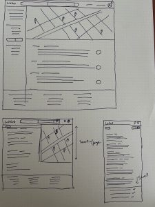
The image above shows a simple pen-on-paper wireframe for a proposed website.
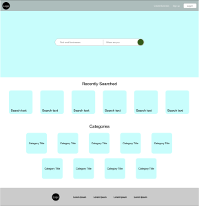
The image above shows a more complex version of a wireframe for a proposed website.
Navigation: Keep It Simple
Rather than just adding a new item to a drop-down menu, look for opportunities to combine some items in your menus. Using boxes and icons to visually highlight content can help readers find what they’re looking for. As an example, the Financial Planning Association Minnesota Chapter came to us with a site that didn’t use the brand colors of the national association. Some of the drop-down menus had so many options that it was difficult to use on a mobile device. Some of the fonts were not user-friendly.
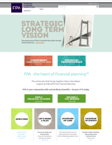
The image above shows a portion of the FPA-Minnesota Chapter home page before we redesigned it.
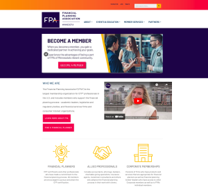
The image above shows a portion of the new FPA-Minnesota Chapter home page after our redesign.
Our team replicated the brand look and feel of the FPA national website. We added photos, video and icons to help readers find information more easily, leading the eye across and down the home page. Check out the updated website. We’ve had feedback from members, saying (among other things) that event registration flows much more smoothly.
Conference Central Pages
For major events, we’ve found that creating an eye-catching conference central page helps people find information quickly and – importantly – sign up to attend the event. Here’s a before-and-after comparison for the Minnesota Asphalt Pavement Association (MAPA).
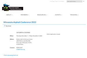
The image above shows how the MAPA conference pages looked prior to our updates.
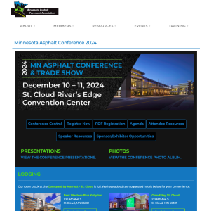
The image above shows how the MAPA conference central page looked for the 2024 event.
Project Management
A good project management system (our team uses Asana) will make it easier for your design team to hit deadlines and stay organized. Because Ewald Consulting frequently does website redesigns, we developed a template that can be customized for each website redesign project. It can be easy to overlook some of the little things during a major revamp, so having a strong template keeps the design team on track.
Regular check-ins with the volunteer team are essential to ensure that the redesign is meeting expectations for look and usability. Getting approval on a key page will help inform the work on additional pages, saving time for the designers.
Review Regularly
We update our clients’ sites at least monthly. Regularly, a couple of our Marketing Communication team members who specialize in usability review every site we manage to suggest ways to streamline material, organize information in a more cohesive way and remove material that is no longer needed. “This preventive measure helps so we don’t have to do the big overhauls as frequently,” Nicki says. We also do annual SEO reviews of our client websites to help ensure that content can be easily found.
If your website needs a fresh look or a complete overhaul, contact us! Our team of talented design and usability specialists is here to help.


